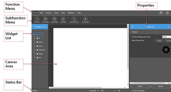
22.6.1 Widget builder operating environment
The entire widget development software interface generally consists of the "Functional Menu", "Widget List", "Property Page", "Status Bar", and the "Canvas Area" in the middle
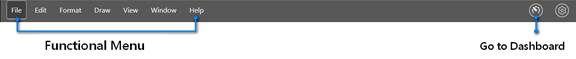
22.6.1.1 Functional Menu
Thefunctional menu on the top of the window allows you to select the main functions.
22.6.1.2 Sub-function column
The sub-function column below the functional menu provides fast tool options according to the various main functions.
22.6.1.3 Widget list
You can see the established widget in the Widget list on the left. The widget displays the stored Widget files in the form of a tree structure.
Left click on the widget file name to display the widget contents on the canvas.
Right click the mouse on the Widget list folder to create the folder or file, change the folder name, or delete it. Right click the Widget list file name to change its name or delete it.
To conceal the Widget list, you may click  to hide the tree diagram, and the Widget list will fold. To display, click
  to unfold again.
22.6.1.4 Property page
Browse the property page on the right of the browser window to provide the property setting of the selected components in the canvas. It will display the setting options according to the different components. The setting of objects and animation can be modified through the property page. The canvas properties will be displayed when a component is not selected.
To conceal the property page, click to hide the tree diagram, and the Widget list will fold. To display, click  to unfold it again.
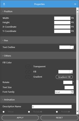
22.6.1.5 Property display and modification
The property page can be divided into "Location", "Line", "Others", and "Animation". After selecting the object on the canvas, the property page will display the related parameter values and settings. Furthermore, the object can also be modified by pressing the "application" button.
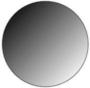
22.6.1.6 Fading color filling
 |
22.6.1.7 Message column
Users can check the object coordinates and default properties in the message column.
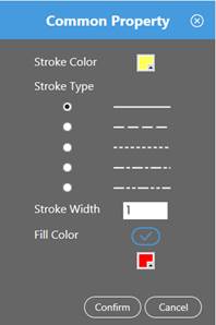
Among them, the default properties have preset line colors, types, width, and other properties to provide a rapid, unified format set. The frame window is as follows. After the setting, the status bar will display the corresponding format.
The right side of the message column can display the related message hint in the operating process.
22.6.1.8 Canvas
All components can be edited in the canvas area in the middle of the screen.