 Linear Gauge is used to display 1 to 3 real-time data of WebAccess Tags based on Linear Gauge
22.4.21 Linear Gauge
Linear Gauge is used to display 1 to 3 real-time data of WebAccess Tags based on Linear Gauge
Function
Support Gauge point type:Circle, range bar, Rhombus, and rectangle in horizontal or vertical direction.
Support main Range and sub range setting
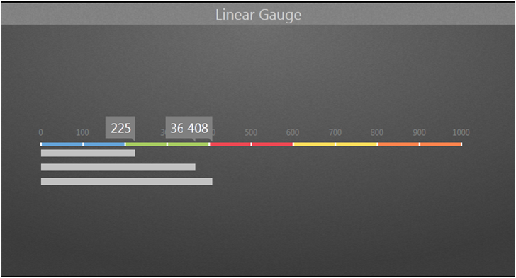
Linear Gauge picture
Properties:
Preferences:Build the different Properties of Linear Gauge widget. Users can choose one Preferences and apply the properties directly next time usage.
Create:Create the current Properties as this widget Preferences
Update:Change the Properties of this widget Preferences
Delete:Delete this widget preferences
Set as default:User can set the widget preferences as default Widget display
Widget Setting:Set the related properties of widget, such as Widget name, Frame Color, Background, Time Interval, etc…
Widget name:Name of Widget. The title show on the top of Widget when mouse move to the top and appear blue area
Frame Color:Widget frame color
Background:Set Widget background Color.
Image:Upload and delete Widget background image
 Select the image from WebAccess widget background folder in C:\inetpub\wwwroot\broadweb\WADashboard\dResource\bkImage\daWidgetBk
 Upload the image from folder
 Cancel the background
Extended:Extend Widget background image to whole widget.
Background without title:The background extend to Title area or not
Height in Mobile Phone:Config the widget display height in Mobile. Choose full size, half size or quarter size in two phone display types, such as Small Portrait and Small Landscape. User also can self-define the display height with unit px.
Time Interval:Set data refresh time in PC/Pad and Phone mode (unit: Days/ Hours/ Minutes/ Seconds).
Title:The top area of the Widget is the Title. Type the title of Widget and Set the related Properties of title
Text:Type the title in three languages
Font Name:Set the Title font
Font Size:Set the Title font size
Font Color:Set the Title font Color
Background:Set the Title area background Color
image:Upload the Title area background image
Select the image from WebAccess Widget Title background folder in C:\inetpub\wwwroot\broadweb\WADashboard\dResource\bkImage\daWidgetTitleBk
Upload the image from folder
Cancel the background
Extended:Extend the background image to whole title area
Gauge Setting :
Style : Set different styles of point indicator of the current Gauge. Ex, Circle, Range Bar, Rhombus, and Rectangle
Orientation : Set Linear Gauge vertical or horizontal
Color : Set the color of the value indicator
Main Range Setting :
Span Low : The minimum range value of the Meter
Span High : The maximum range value of the Meter
Tick Interval : The tick scale between Span Low and Span High
Label Color : The text color of the Tick Interval
Scale Color : The scale tick color
Tick Length : The length of each tick
Scale Position : The position of the tick relative to the line
Scale Color : The base/background color of the Meter
Sub Range Setting :
Number : The number of the range will appear on the gauge
From : The span low of the range
To : The span high of the range
Color : The color of the range
Label Setting :
Data Label : Visible or Invisible Labels in the Widget
Style : The style of the label
Color : The Background color of the label
Size : The font size of the label
Tooltip : Visible or Invisible Tooltips in the Widget
WebAccess Data Source :
Number : The number of the Tags (maximum of 5)
Tag : Choose the desire tag from WebAccess