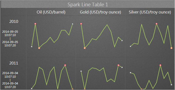
 Spark Line Table 1 use spark line to display the trend of different historical data. User can compare maximum 9 trends in one Widget.
22.4.16 Spark Line Table 1
Spark Line Table 1 use spark line to display the trend of different historical data. User can compare maximum 9 trends in one Widget.
Function
Support maximum 3 Tags and 3 time periods
Support Trend types:line / spline / stepline / area / spline area / step area / bar
Support Commander Widget (buttons / radio buttons / drop-down menu) connections to switch the trend group in Dashboard Viewer.
Support change time periods in runtime.
Properties:
Preferences:Build the different Properties of Spark Line Table 1 widget. Users can choose one Preferences and apply the properties directly next time usage.
Create:Create the current Properties as this widget Preferences
Update:Change the Properties of this widget Preferences
Delete:Delete this widget preferences
Set as default:User can set the widget preferences as default Widget display
Widget Setting:Set the related properties of widget, such as Widget name, Frame Color, Background, Time Interval, etc…
Widget name:Name of Widget. The title show on the top of Widget when mouse move to the top and appear blue area
Frame Color:Widget frame color
Background:Set Widget background Color.
Image:Upload and delete Widget background image
 Select the image from WebAccess widget background folder in C:\inetpub\wwwroot\broadweb\WADashboard\dResource\bkImage\daWidgetBk
 Upload the image from folder
 Cancel the background
Extended:Extend Widget background image to whole widget.
Background without title:The background extend to Title area or not
Height in Mobile Phone:Config the widget display height in Mobile. Choose full size, half size or quarter size in two phone display types, such as Small Portrait and Small Landscape. User also can self-define the display height with unit px.
Time Interval:Set data refresh time in PC/Pad and Phone mode (unit: Days/ Hours/ Minutes/ Seconds).
Title:The top area of the Widget is the Title. Type the title of Widget and Set the related Properties of title
Text:Type the title in three languages
Font Name:Set the Title font
Font Size:Set the Title font size
Font Color:Set the Title font Color
Background:Set the Title area background Color
image:Upload the Title area background image
Select the image from WebAccess Widget Title background folder in C:\inetpub\wwwroot\broadweb\WADashboard\dResource\bkImage\daWidgetTitleBk
Upload the image from folder
Cancel the background
Extended:Extend the background image to whole title area
Text:Set enable or disable auto resize text with resolution.
Control Panel:The property enables View control Panel in PC mode and Mobile mode. The Control Panel show in the bottom of Widget.
Table Setting:Set table properties.
Text Size:Set the table text size of the Widget
Text Font:Set the table text font of the Widget
Text Color:Set the table text color of the Widget
Border:Visible or Invisible the table border of the Widget
Border Width:Set the table border width of the Widget
Border Color:Set the table border color of the Widget
Border Type:Choose the display border type, including solid, dotted, dashed, double, groove, ridge, insert, outset.
Line Setting:set the line properties
Animation:Enable or Disable animation of the spark line widget.
Line:Choose the display line type, including line, spline, step line, area, spline area, step area, bar.
Major Color:Set the line color of the Widget
StartEnd Point:Visible or Invisible the start and end point of the Widget
StartEnd Color:Set the start and end point color of the Widget
MaxMin Point:Visible or Invisible the max and min point of the Widget
Max Point Color:Set the max point color of the Widget
Min Point Color:Set the min point color of the Widget
Tooltip:Set the properties of Tooltips. Tooltips show the data value when moving the mouse to the data point in the spark line widget.
Tooltip:Visible or Invisible Tooltips in the Widget
Color:Set the Tooltip text color
Commander:Set the link with Commander widget in the same Dashboard area. Choose one connection to switch Tag group display of the trend
Time:Support Start Interval mode of Time Setting.
Time Set:Choose the number of time set, support maximum 3 time periods.
Time Interval:Set total time interval and type
Time set property:
Title:The title of time set
Start Time:Set start date.
Hours:Set hour
Minutes:Set minutes
Tag:Connect the Tag and the spark line display and set the properties of the spark line.
Data Type:Choose the type of data, including Last, Maximum, Minimum, and Average.
Group Name:Set the name of group
Number:Choose the number of tag, support maximum 3 tags.
Tag Property:
Tag:Choose one Tag of the trend
Replace Text:Use custom tag name to replace the default name of tag
Add Group:Add trend group. User can switch trend group with control panel.
Delete Group:Delete group.